
The Table visualization displays your Dynamic Board data as a customizable, multi-column table. Use it when you need a large, sortable overview of profile or label performance across many metrics — for example, to rank profiles or labels by a chosen KPI.
Dynamic Boards in Unified Analytics are currently in early access. Contact your Customer Success Manager to request participation in the early access program. Some features may not be available or may change before the full release.
Before you begin
-
You can add a Table visualization to any Dynamic Board you can edit.
-
The Table visualization is available for the following data sets: Social channels (post level and profile level), Listening, Paid, and Community.
The Table visualization does not support the Care data set, yet.
Add a table to a board
-
Open or create a Dynamic Board in Unified Analytics.
-
Add a widget, or edit an existing one, to open the Edit widget dialog.
-
In Widget name, enter a name for the table.
-
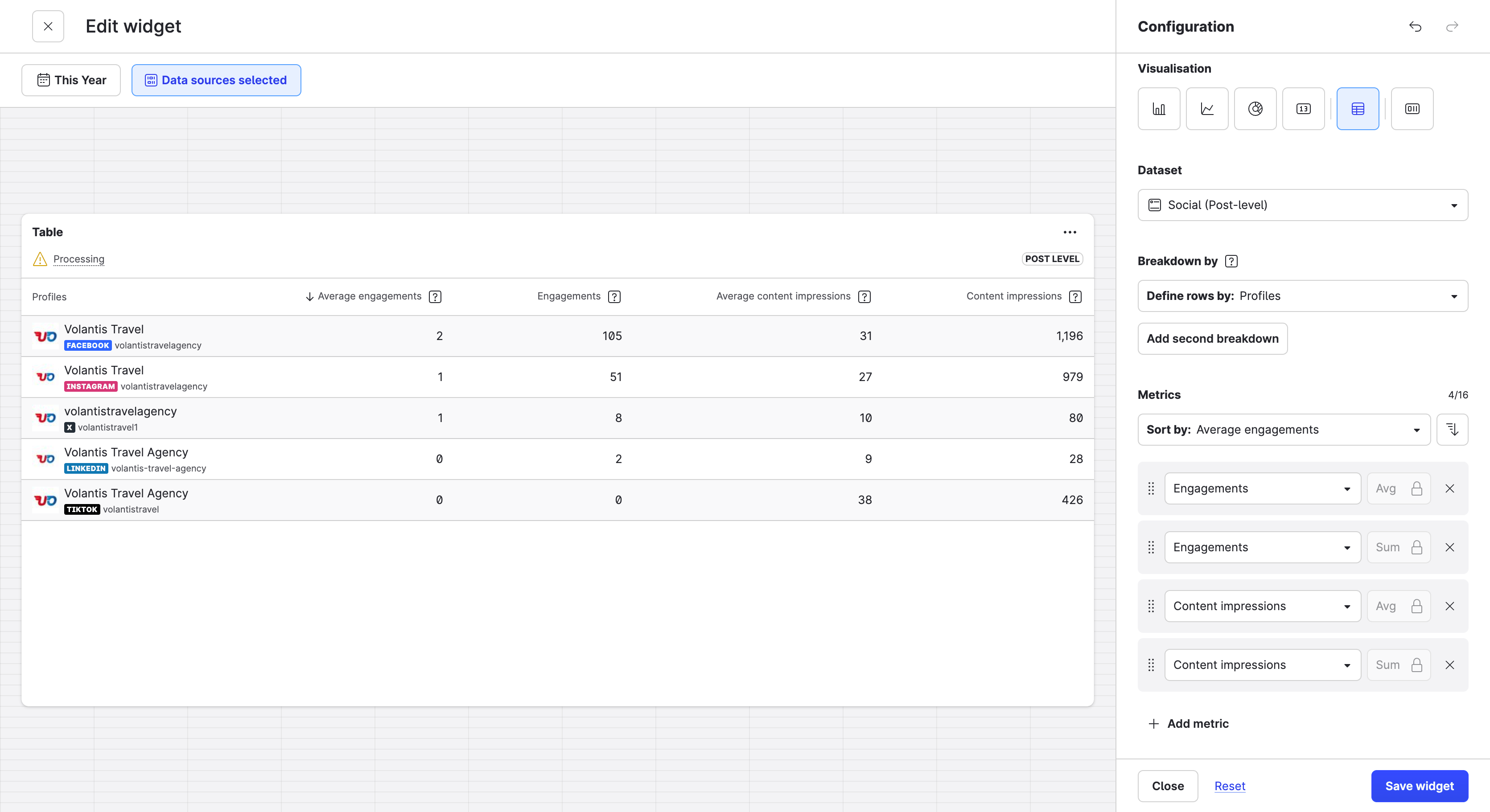
Under Visualisation, select the table icon.
-
Under Data set, select a data set (for example, Social channels).
-
Under Metric/s, select the metrics you want to show as columns and drag them into the order you want.
-
Choose the dimension for the rows (for example, profiles, platforms, or labels). Optionally, add a second dimension to group the rows.
-
In Sort by:, choose the metric or the row attribute to sort by, and the direction (ascending or descending).
-
Click Add to board.
Choose metrics and aggregation
Each metric you select becomes a column. For each metric, choose an aggregation:
-
SUM — totals the values.
-
AVG — averages the values.
Some metrics support only one aggregation; in that case the aggregation is preselected and cannot be changed. You can add the same metric more than once with different aggregations. The aggregation appears in the column header — for example, interactions (SUM) and average interactions (AVG).
Group rows with dimensions
-
The first dimension sets the rows and the first column. The first column shows the dimension with its encoding — for example, a profile name with its avatar, or a platform name with its icon.
-
The second dimension groups the rows. Grouped rows are sorted alphabetically in ascending order.
Sort the table
Use Sort by: to sort by any metric column or by the row attribute, ascending or descending. When you add your first metric, it becomes the sort metric by default.
Tip: To rank profiles or labels by a KPI, set profiles or labels as the row dimension and sort by the metric you care about.
Adjust columns
-
You can keep up to two of the first columns fixed (sticky) while you scroll.
-
The first column grows with its content up to a maximum width, then wraps.
-
The widget is resizable, and you can scroll it horizontally and vertically.
Export the table
You can export a table in the following formats:
-
PNG — an image of the table, ideal for presentations.
-
XLSX — the table data, with numbers, percentages, and currencies keeping their formatting.
-
CSV — the table data, for further analysis.
For all export options, see Share a Unified Analytics Widget.