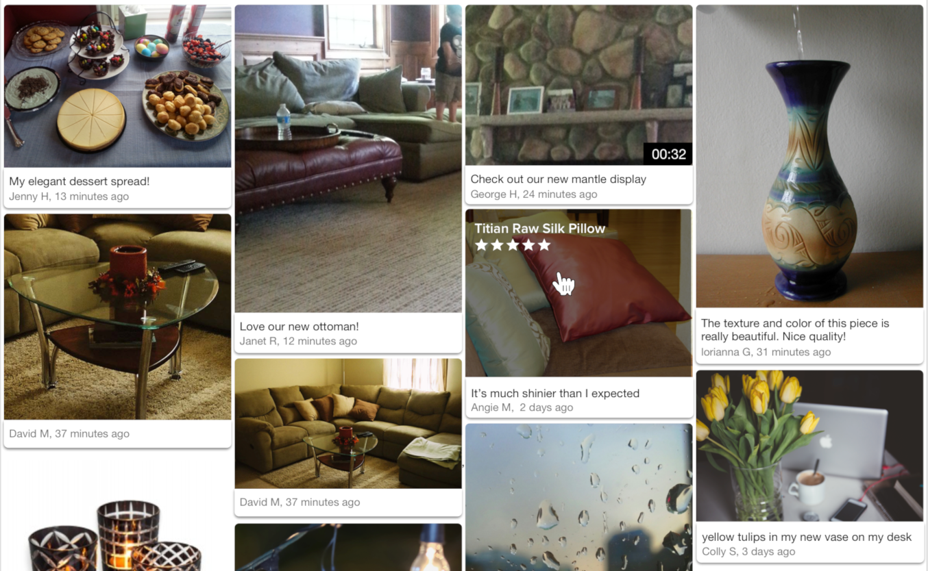
Visual Content Pinboard

Overview
The Emplifi Ratings & Reviews Visual Content pinboard showcases customer-submitted images and videos in a responsive browsing experience. The pinboard shows submitted visual content along with a caption, username, and datestamp (optional). Clicking on an image opens the visual content modal, which displays an enlarged version of the media, the caption, user name, datestamp, product name, and a "Shop Now" button.
Design
The Visual Content pinboard is responsive for both mobile and desktop displays. Images automatically resize at configurable breakpoints. Additional visual elements include an option to automatically load media in progressive batches or display a "load more" button, the ability to display review stars and product title on hover, and adjustable spacing between visual content items.
Content
Intended for installation on its own landing page, the Visual Content pinboard displays published visual content for one or more SKUs, brands, tags, or product categories, or any combination thereof. The pinboard can be configured to not appear when the visual content available does not meet a minimum quantity, and it can filter out media based on caption character length and word count.
Conversion tracking
The pinboard does not currently report user events to Emplifi and its use will not be reflected in Emplifi Ratings & Reviews conversion reporting. There is a configuration option that can be used to trigger an event record in your analytics package. See Configuration for details.
Installing the Visual Content pinboard
Steps:
Place the following code into the
<head>of your page: If you are a TurnTo.eu customer, change
 turnto.comtoturnto.euin this snippet.CODE<script> var turnToConfig = { locale: "en_US", pageId: "vc-pinboard-page", vcPinboard: { // Add SKUs, tags, brands, or any combination. } }; window.TurnToCmd=window.TurnToCmd||function(){(TurnToCmd.q=TurnToCmd.q||[]).push(arguments)}; </script> <script src="https://widgets.turnto.com/v5/widgets/YOUR SITE KEY/js/turnto.js" async></script>Replace
YOUR SITE KEYwith the appropriate value.To display the Visual Content pinboard, add this div element. The widget dynamically inserts content into the element.
CODE<div id="tt-vc-pinboard-widget"></div>
Widget refresh function
To use the Visual Content pinboard on a page that switches SKUs, product categories, brands, or tags dynamically, use the built-in set function. It can be called with any SKU, brand, or tag in the following manner:
TurnToCmd('vcPinboard.set', {skus: ['sku1','sku2'], brands: ['brand1','brand2'], tags: ['tag1','tag2']})After calling this function, the widget is updated with contents that apply to the parameters provided.
Configuration
The following configuration options are available for you to implement. Each configuration is optional and has a default value.
Configuration Setting | Description | Default |
|---|---|---|
skus | Allows you to filter displayed content by one or more SKUs or categories. Must be set as an array. An empty array means all SKUs. | empty array |
tags | Allows you to filter displayed content by one or more tag codes. Must be set as an array. | empty array |
brands | Allows you to filter displayed content by one or more brands. Must be set as an array. | empty array |
onFinish | Callback function that is called after the pinboard finishes loading. You can use this configuration to trigger an event record in your analytics package. See Event Callbacks for more detail. | empty function |
To customize the visual content pinboard, add your configurations in the vcPinboard property within the turnToConfig object. Here is an example:
<script type="text/javascript">
  var turnToConfig = {
    ...
    vcPinboard: {
      skus: ['sku1','sku2','sku3'],
      tags: ['tag1','tag2','tag3'],
      brands: ['brand1','brand2','brand3'],
      onFinish: function(){}
    }
    ...
  };
</script>
The following configuration options are also available and can be requested from your Emplifi Customer Success Manager:
Configuration Setting | Description | Default |
|---|---|---|
Show datestamp | Whether the datestamp displays on the pinboard. Datestamps always display on the modal detail view. | true |
Sort order | Options:
| most recent |
Limit | Maximum number of items to display on page load. Remaining items are loaded in batches equal to the limit. | 20 |
Active only | Only return content for active products. | true |
Show caption | Whether the caption displays on the pinboard. Captions always display on the modal detail view. | true |
Minimum caption character count | Only show media items with this many characters or more in the caption. | 0 |
Minimum caption word count | Only show media items with this many words or more in the caption. | 0 |
Maximum caption length | Maximum length of caption text characters to display. Captions longer than this length end with an ellipsis (...). | 85 |
Hover title max length | Maximum character length of the product title shown over the visual content image on hover. | 65 |
Progressive loading | If 'true', loads available content when the user gets to the bottom of the page. If 'false', displays a 'load more' button. | true |
Show review stars | On image hover, display review stars (if available) below product title. | false |
Name maximum length | The maximum length of the user's name. Names longer than this length end with an ellipsis (...). | 255 |
Horizontal spacing | Used for horizontal spacing between items. Value is in pixels. | See Breakpoints. |
Vertical spacing | Used for vertical spacing between items. Value is in pixels. | See Breakpoints. |
Breakpoints
The default breakpoints are at these viewport widths, which are based on container width. All sizes are in pixels.
Viewport | Minimum width | Maximum width | Horizontal spacing | Vertical spacing |
|---|---|---|---|---|
751 | 250 | 333 | 8 | 8 |
375 | 164 | - | 8 | 8 |
0 | 150 | - | 8 | 8 |
