Overview
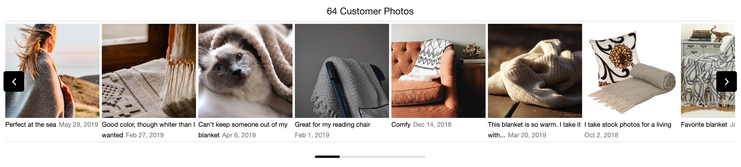
The Visual Content Gallery Row widget showcases end-user submitted visual content (photos and videos) for one or more SKUs or product categories. It is intended for installation primarily on the product detail page, typically between the site's product image and the product detail tabs. The widget could also be used on a category page or other landing page.
Design
The widget is responsive for both mobile and desktop displays. Images automatically resize at configurable breakpoints. All our visual thumbnails are cropped and centered, so they display well regardless of aspect ratio. Additional visual elements include an optional progress bar, next and back arrows whose location and style are configurable, a set of breakpoints to control image size and caption display, and adjustable spacing between visual content items.
Content
The gallery row widget displays published visual content for one or more SKUs or product categories. It can be configured to not appear when the visual content available does not meet a minimum quantity and it can filter out media based on caption character length and word count. The gallery row widget returns a maximum of 200 items and only gets content for active products.
Conversion tracking
This widget does not currently report user events to Emplifi and its use will not be reflected in Emplifi Ratings & Reviews conversion reporting. A configuration option can be used to trigger an event record in your analytics package. See Configuration for details.
Installing the Gallery Row widget
Steps:
-
Place the following code into the
<head>of your page:
This turnToConfig snippet controls all installed Emplifi Ratings & Reviews widgets. It should be placed only once.
<script>
  var turnToConfig = {
    locale: "en_US",
    pageId: "pdp-page",
    gallery: {
      // Add one or more SKUs as an array.
      skus: ['YOUR SKU','ANOTHER SKU (OPTIONAL)','ANOTHER (OPTIONAL)']
    }
  };
  window.TurnToCmd=window.TurnToCmd||function(){(TurnToCmd.q=TurnToCmd.q||[]).push(arguments)};
</script>
<script src="https://widgets.turnto.com/v5/widgets/YOUR SITE KEY/js/turnto.js" async></script>
If you are a TurnTo.eu customer, change
turnto.comtoturnto.euin this snippet. -
Replace
YOUR SKUandYOUR SITE KEYwith the appropriate values, and add more SKUs, if needed. -
To display the Visual Content Gallery Row widget, add this div element. The widget dynamically inserts content into the element.
<div id="tt-gallery-row"></div>
Widget refresh function
To use the Visual Content Gallery Row widget on a page that switches product SKUs dynamically, use the built-in gallery.set function. It can be called with any SKU in the following manner:
TurnToCmd('gallery.set', {skus: ['sku1','sku2'], tags: ['tag1','tag2']})
After calling this function, the widget is updated with contents that apply to the provided SKUs.
Configuration
The following configuration options are available for you to implement. Other than skus, each configuration is optional and has a default value.
|
Configuration Setting |
Description |
Default |
|---|---|---|
|
skus |
Comma-separated list of SKUs. This configuration must be specified, but can be an empty array. An empty array of SKUs means all SKUs. |
empty array |
|
tags |
Allows you to filter displayed content by one or more tag codes. Must be set as an array. |
empty array |
|
onFinish |
Callback function that will be called after the widget has finished loading. This configuration can be used to trigger an event record in your analytics package. See Event Callbacks for more detail. |
empty function |
To customize the gallery row widget, add your configurations in the gallery property within the turnToConfig object. Here is an example:
<script type="text/javascript">
  var turnToConfig = {
    ...
    gallery: {
      skus: ['sku1','sku2','sku3'],
      tags: ['tag1','tag2','tag3'],
      onFinish: function(){}
    }
    ...
  };
</script>
The following configuration options are also available and can be requested from your Emplifi Customer Success Manager:
|
Configuration Setting |
Description |
Default |
|---|---|---|
|
Sort order |
Options:
|
most votes |
|
Minimum content count |
Hide the widget unless there are this many visual content items to display. |
1 |
|
Minimum text content character count |
Only show media items with this many characters or more in the caption. |
0 |
|
Minimum text content word count |
Only show media items with this many words or more in the caption. |
0 |
|
Include syndicated |
Sets whether the widget should show syndicated content. |
false |
|
Include product siblings |
Sets whether the widget should show visual content for related sibling and child SKUs. |
false |
|
Breakpoint sizes |
An array of breakpoint sizes, which are relative to gallery width. |
See Breakpoints. |
|
Show captions |
You can choose to show or hide captions. Configurable for each breakpoint. If shown, captions display below thumbnail images. |
false |
|
Truncation length |
If captions are shown, the text is truncated at this many characters. Set once for all breakpoints. Truncated text ends with an ellipsis (...). |
40 |
|
Arrow location |
Determines where the pagination arrows display. Options:
|
bottom |
|
Arrow style |
Options:
|
icon |
|
Column spacing |
Amount of space, in pixels, between visual content items. |
4 |
|
Show progress bar |
Display an indicator of where the user is in the pagination. |
false |
Breakpoints
The default breakpoints are at these gallery widths and result in these image widths, in pixels:
|
Gallery width |
Image width |
|---|---|
|
0 |
88 |
|
480 |
96 |
|
768 |
112 |
|
1024 |
136 |
|
1200 |
160 |