Skip table of contents

Design Editor Options

Editing any of the options in the category panels customizes the look and feel of your widgets.

Global

The Global section includes customization options for your entire widget.

Click to expand Global options:
  • Font
    Choose a font from our preloaded selection, or import an external font.
    (warning) When uploading your font, please note that we can only support file types otf, woff, woff2, and ttf.

  • Color
    (info) Aside from the following choices, additional color customization is available through custom CSS.

    • Primary Color
      The color for all the buttons and the header text.

    • Secondary Color
      The color for text in buttons.

Header

The Header section includes customization options for your widget header.

Click to expand Header options:
  • Background
    Add a custom background image to the top of your widget.

  • Title
    Adjust the font size and weight of the title of your widget.

  • Description
    Adjust the font size and weight of the description of your widget.

  • Upload Button
    Show or hide the button below your widget description that allows your shoppers to upload content directly to the album inbox associated with your widget. You can also adjust the font size and font weight for the button.

  • End Tile Upload Button
    Show or hide the end tile upload button that allows your customers to upload content directly to the album inbox associated with your widget. You can also adjust the font size and font weight of the text within the tile.

    94246820.png

    (tick) 
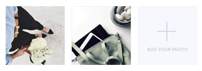
The end tile upload button is great for albums with only a few photos or videos.

Widget

The Widget section includes customization options for your actual widget display. Some options are common to all widget display while other options are available depend on the Display Layout you select.

Common Widget Options

Click to expand common options:

The following option is available for all display layouts except Slideshow:

  • Review Tile
    The review tile is available when your display has enabled Show favorite reviews:

    • Font Size
      Change the size of the font.

    • Star Size
      Change the size of the star next to the review..

    • Background image
      Add the product image as a background to the review section.

    • Frequency
      Determine how often reviews appear in the widget.

The following options are available for the Photowall (full page and carousel), Horizontal, Vertical, and Coverflow display layouts:

  • Photo Tile Hover
    Change whether tiles animate when a shopper hovers their cursor over them on desktop computers.

  • Photo Tile User Handle
    Show or hide the name of the user who uploaded the asset when a shopper hovers over the tile on desktop computer. You can also adjust the font size and font weight. If the hover animation is disabled, these settings have no effect.

  • Photo Tile Caption
    Show or hide the shopper-submitted caption when a shopper hovers over the tile on desktop computer. You can also adjust the font size and font weight. If the hover animation is disabled, these settings have no effect.

  • Photo Tile Submitted Date
    Show or hide the submission date of the asset when a shopper hovers over the tile on desktop computer. You can also adjust the font size and font weight. If the hover animation is disabled, these settings have no effect.

Full Page Gallery Options

Click to expand options for Photowall (Full Page Gallery):

Available when your Display Layout uses a full page Photowall gallery:

  • Photowall Options

    • Photo Size
      Change the size of the photo tiles.

    • Gutter Size
      Change the size of the space between the photo tiles.

  • Load More Button
    Show or hide the Load More button for shoppers. You can also adjust the font size and font weight, enable or disable the hover animation for the button, or set the gallery to Infinite Load.

Click to expand options for Mosaic (Full Page Gallery):

Available when your Display Layout uses a full page Mosaic gallery:

  • Mosaic Options

    • Number of Photos/Videos
      Change the number of photos or videos that appear before a shopper needs to click Load more, or how many photos or videos appear at a time when Infinite Load is enabled.

    • Infinite Load
      Instead of giving shoppers the option to Load more, more items will load as they scroll down the page.

    • Font Size
      Change the size of the font in the Load more button.

    • Font Weight
      Change the weight of the font inside the Load more button.

    • Hover Animation
      Change whether tiles animate when a shopper hovers their cursor over them on desktop computers.

Carousel Options

Click to expand options for Photowall (Carousel) :

Available when your Display Layout uses a Photowall carousel gallery:

  • Photowall Options

    • Photo Size
      Change the size of the photo tiles.

    • Gutter Size
      Change the size of the space between the photo tiles.

    • Smooth Swiping
      Change how the swipe animation transitions between tiles on tablet and mobile.

    • Show Pagination Dots
      Change whether pagination dots are visible or hidden. This is purely cosmetic. It is not an alternative navigation method.

  • Navigation Arrows
    Customize the left and right navigation arrows. The recommended image dimensions are 45px x 90px. You can also change whether the navigation arrows overlay the gallery assets or are next to the gallery assets.

Click to expand options for Mosaic (Carousel):

Available when your Display Layout uses a Mosaic carousel gallery:

  • Mosaic Options

    • Hover Animation
      Change whether tiles animate when a shopper hovers their cursor over them on desktop computers.

    • Smooth Swiping
      Change how the swipe animation transitions between tiles on tablet and mobile.

    • Show Pagination Dots
      Change whether pagination dots are visible or hidden. This is purely cosmetic. It is not an alternative navigation method.

  • Navigation Arrows
    Customize the left and right navigation arrows. The recommended image dimensions are 45px x 90px. You can also change whether the navigation arrows overlay the gallery assets or are next to the gallery assets.

Click to expand options for Horizontal and Vertical:

Available when your Display Layout uses either a Horizontal or Vertical carousel gallery:

  • Photo Size
    Change the size of the photo tiles.

  • Gutter Size
    Change the size of the space between the photo tiles.

Click to expand options for Coverflow:

Available when your Display Layout uses a Coverflow carousel gallery:

  • Photo Size
    Change the size of the photo tiles.

Slideshow Options

Click to expand options for Slideshow:

Available when your Display Layout uses a Slideshow gallery:

  • Autoplay
    Change whether the slide show is animated or static.

  • Show lightbox
    Display or hide the lightbox appears when a shopper clicks on an asset.

  • Slideshow Interval
    Set the speed of the slideshow animation. If Autoplay is disabled, this option has no effect.

Lightbox

The Lightbox is what you see when you open a photo or video in a widget. This category allows you to make changes to your display's lightbox design

Click to expand Lightbox options:
  • User Avatar
    Show or hide the user avatar in the lightbox.

  • User Handle
    Adjust the font size and font weight of the displayed user handle in the lightbox.

  • Close Button
    Upload a custom close button image for exiting the lightbox. The recommend image dimensions are 59px x 59px.

  • Navigation Arrows
    Customize the left and right navigation arrows within the lightbox. The recommended image dimensions are 50px x 100px. You can also adjust the position of the arrows.

  • Caption
    Show or hide image captions and adjust the font size and font weight for displayed captions.
    (info) So that shoppers receive credit for their published content, we don't disable the usernames.

  • Product Image
    Adjust the size and location for displayed product images when photos or videos have tagged products.

  • Product Name
    Adjust the font size and font weight of the displayed product names when photos or videos have assigned products.

  • Buy Now Button
    Adjust the font size and font weight of the button for a product when photos or videos have tagged products.
    (info) If you would like to remove the button, add the following line of code to Custom CSS:

    CSS
    #photo_lightbox_wrapper #right_panel #middle_block #cta_container{display:none!important}

Uploader

In this section you can customize the uploader functionality, workflow, and terms of service for a widget. The uploader allows customers to submit their photos directly within a widget. You can turn the Upload Now button on or off and customize its look in the Header section of the design editor. You can edit the text manually to a different language, as well.

Click to expand Uploader options:
  • Review Panel
    Require captions for submissions, change the caption placeholder, and enable Shopper-submitted Product Tags for Content Received through Direct Uploader.

  • Submit Panel
    Customize the fields and check boxes for submissions to collect additional info from your customers. We always request the names and email addresses for submission. Examples of additional fields include location, phone number, age, etc.

  • Thank You Panel
    Customize where to redirect shoppers to to after they submit an asset and click Finish.

Localization

This section allows you to customize the text of buttons and other messaging within the widget experience. Some of these include the text for the Source Panel, Submitting Content, and Uploader Warning. You can edit the text manually to a different language, as well. 

Custom CSS 

You can add your own CSS code to this section to fully customize your widget. Find our full custom CSS widget styling guide.

Pixlee_Widget_CSS_Manual.pdf

Professional Services CSS 

Any professional service CSS that our team has helped you customized will be added here. If you'd like to inquire more information about this, please reach out to your Customer Success Manager or Support.

Do you have feedback or more questions? You can contact us through our Emplifi Customer Center.

JavaScript errors detected

Please note, these errors can depend on your browser setup.

If this problem persists, please contact our support.