Skip table of contents

Iconography

SpeedFlex uses SVG icons. The color fill for each is defined by CSS and based on icon type. You can use our set of icons, or specify your own SVG code to be used for each icon.

Icon List

Icon

Icon Name

Where the Icon is Used

Filled arrow icon

arrow-fill

  • Q&A Content - open dropdown

back arrow icon

back arrow

  • Visual Content - navigate back

down caret icon

caret-down

  • Review List - indicates a sort and filter drop-down is available; click to expand

  • Visual Content - indicates the review is longer than the space available

left caret icon

caret-left

  • Q&A Content - go to previous page

  • Review List - go to previous page

  • Instant Answers - go back (shown in the Back button on a search result item)

  • Comment Capture - go to previous page

right caret icon

caret-right

  • Q&A Content - go to next page

  • Review List - go to next page

  • Instant Answers - see more details (shown in list items of search results)

  • Instant Answers - submit new question (shown in button)

  • Comment Capture - go to next page

  • Comment Pinboard Teaser - see more comments (shown in button)

checkmark icon

check

  • Q&A Content - indicates selected items in the multi-item modal

  • Review List - indicates an item is selected in the sort drop-down

  • Informational Modal - decorative icon indicates the modal is for information

empty checkbox icon

checkbox-off

  • Review List - indicates an item is not selected in a filter dropdown

checkbox with checkmark

checkbox-on

  • Review List - indicates an item is selected in a filter dropdown

x icon

close

  • Q&A Content - remove an item from a multi-item answer

  • Review List - remove a filter

  • Review List - remove content in a search field

  • Visual Content - remove visual content items from a review (appears in review forms on icons)

  • Instant Answers - clear search field

  • Instant Answers - remove item from multi-item questions

  • Modals - close modal

adjust controls icon

controls

  • Review List - indicates show/hide filter controls (shown in button)

delete icon

delete

  • Comment Capture - delete comment

error icon

error

  • Form Fields - indicates an error (shown beside error text)

  • Error Modal - decorative icon indicates the modal is for an error

Empty flag icon for unflagged objects

flag-off

  • Q&A Content - indicates the answer is not flagged as inaccurate; click to flag (appears in the mobile action dropdown)

  • Review List - indicates the review is not flagged; click to flag

  • Visual Content - indicates visual content is not flagged; click to flag (appears in the mobile action dropdown)

Filled flag icon for flagged objects

flag-on

  • Q&A Content - indicates the answer is flagged as inaccurate; click to unflag (appears in the mobile action dropdown)

  • Review List - indicates the review is flagged; click to unflag

  • Visual Content - indicates the visual content is flagged; click to unflag (appears in the mobile action dropdown)

empty heart icon indicating helpful hasn't been selected

helpful-off

  • Q&A List - indicates the answer is not voted as helpful; click to vote for it

  • Review List - indicates the review is not voted as helpful; click to vote for it

  • Visual Content - indicates the visual content is not voted as helpful; click to vote for it

Filled heart icon indicating helpful was selected

helpful-on

  • Q&A List - indicates the answer is voted as helpful; click to remove vote

  • Review List - indicates the review is voted as helpful; click to remove vote

  • Visual Content - indicates the visual content is voted as helpful; click to remove vote

information icon

info

  • Form Fields - indicates extra information (shown beside informational text)

Ellipses icon indicating more

more-H

  • Q&A List - indicates an action menu is available; click to open (mobile view)

  • Review List - indicates an action menu is available; click to open (mobile view)

  • Visual Content - indicates an action menu is available; click to open

arrow pointing right indicates next

next-arrow

  • Visual Content - go to next page

collapse icon, vertical arrows

options-collapse

  • Q&A Content - indicates a list of visible answers; click to hide

expand icon, vertical arrows

options-collapse

  • Q&A Content - indicates a list of hidden answers; click to see answers

photo icon camera

photo

  • Reviews - add a photo (shown in button)

question mark icon

question

  • Q&A Content - decorative icon appears in the Q&A list next to "Why did you choose this?" text to indicate comments.

open quote icon

quote

  • Q&A Content - decorative icon appears in the Q&A list next to each comment under "Why did you choose this?"

reply icon arrow pointing left

reply

  • Q&A Content - reply to answer; shown in an action menu for answers

search icon magnifying glass

search

  • Review List - indicates search field

facebook icon

social-Facebook

  • Comments Pinboard - share to Facebook; appears when hovering on a product image

  • Visual Content - share to Facebook; appears in an action menu

pinterest icon

social-Pinterest

  • Comments Pinboard - share to Pinterest; appears when hovering on a product image

  • Visual Content - share to Pinterest; appears in an action menu

twitter icon

social-twitter

  • Comments Pinboard - share to Twitter; appears when hovering on a product image

  • Visual Content - share to Twitter; appears in an action menu

empty star icon

star-empty

  • Review Summary - No reviews - five empty stars appear; click one to open the review form

  • Review Summary - Reviews - five stars represent the average review and empty stars are part of the rating (Example: three filled stars and two empty indicate an average rating of three stars)

  • Review List - five stars represent the possible review and empty stars are part of the rating (Example: three filled stars and two empty indicate the reviewer rated the item three stars)

  • Review - five empty stars appear; click one to indicate your rating (Example: click the third star to indicate a three-star rating.)

  • Do More - five empty stars appear; click one to open the review form

filled star icon

star-full

  • Review Summary - Reviews - five stars represent the average review and full stars are part of the rating (Example: three filled stars and two empty indicate an average rating of three stars)

  • Review List - five stars represent the possible review and full stars are part of the rating (Example: three filled stars and two empty indicate the reviewer rated the item three stars)

  • Review - five empty stars appear; click one to indicate your rating (Example: click the third star to indicate a three-star rating.)

  • Do More - five empty stars appear; click one to open the review form

half-filled star icon

star-half

  • Review Summary - Reviews - five stars represent the average review and half stars are part of the rating (Example: three filled stars, one star-half full and one empty indicate an average rating of three-and-a-half stars)

unhelpful off icon empty upside-down heart

unhelpful-off

  • Review List - indicates the review is not down-voted as unhelpful; click to mark it is unhelpful

unhelpful icon upside-down filled heart

unhelpful-on

  • Review List - indicates the review is down-voted as unhelpful; click to reverse the down-vote

video icon

video

  • Review - add video (shown in button)

vote off icon unfilled triangle

vote-off

  • Q&A List - indicates no vote for the question; click to vote

vote on icon filled triangle

vote-on

  • Q&A List - indicates a vote for the question; click to remove vote

write icon pencil

write

  • Q&A List - write an answer; click to start an answer

  • Comment Capture - edit a comment; click to edit

Preparing Custom Icons

SVG (scalable vector graphic) is a web-friendly graphics format which is infinitely scalable, versatile, and manipulable with code like CSS. Instead of having to generate multiple sizes and colors of icons in PNG format, one SVG icon can be scaled to any size and filled with any color just by using CSS. This saves your designer(s) time, as well as bandwidth on your site.

To help your custom icons look great in our widgets, please follow the guidelines below:

  1. Make sure all grouped shapes/strokes/fills are expanded (often referred to as “expand appearance” or “expand” in vector design programs).

  2. Do not use masks to clip areas of the shape.

  3. Icons should be square in dimension. If the icon shape itself is not square, you can place it within a square artboard and use empty space to fill the dimension. Just remember to export the icon with the dimensions of the artboard.

  4. Check to make sure that any open paths are joined.

  5. Remove any “fill” attributes from your paths. Providing filled icons will prevent the CSS in our system from applying the appropriate theme colors to them. You can remove fills in your design program, or remove them directly from the SVG code. Fill attributes in your code will look like this:

    CODE
    fill="#73d2e6" fill-rule="evenodd"

Here’s an example of how two different types of icons might look in your design program:

image-20240422-105616.png
image-20240422-105640.png

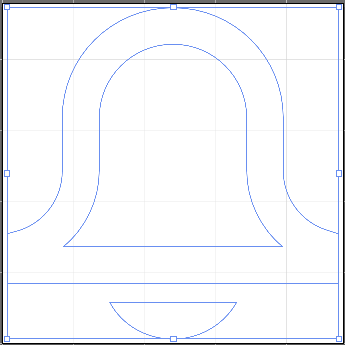
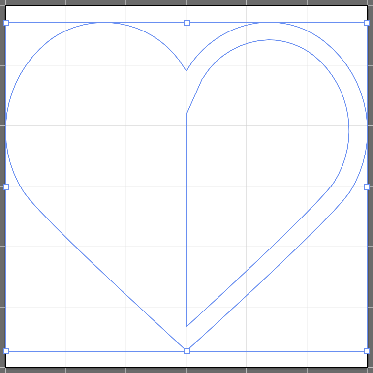
Notice that all paths are closed, there are no masks applied, and the icons are on a square artboard.

Here’s what the SVG code looks like for the bell icon (the example above on the left):

CODE
<svg xmlns="https://www.w3.org/2000/svg" viewBox="0 0 24 24"><title>Bell</title><path d="M4.25,17.19h15.5 a7,7,0,0,1-2.56-5.4V8.1a5.19,5.19,0,0,0-10.38,0v3.69A7,7,0,0,1,4.25,17.19Zm19.44,2.6H.31V16.26L1.2,16a4.39,4.39,0,0,0,3-4.17V8.1a7.79,7.79,0,0,1,15.58,0v3.69a4.39,4.39,0,0,0,3,4.17l.89.3ZM7.53,21.09h8.94a5.14,5.14,0,0,1-8.94,0Z" /></svg>

Notice that the SVG's “viewBox” attribute is set to a square dimension, and that the <path> tag does not have a “fill” attribute.

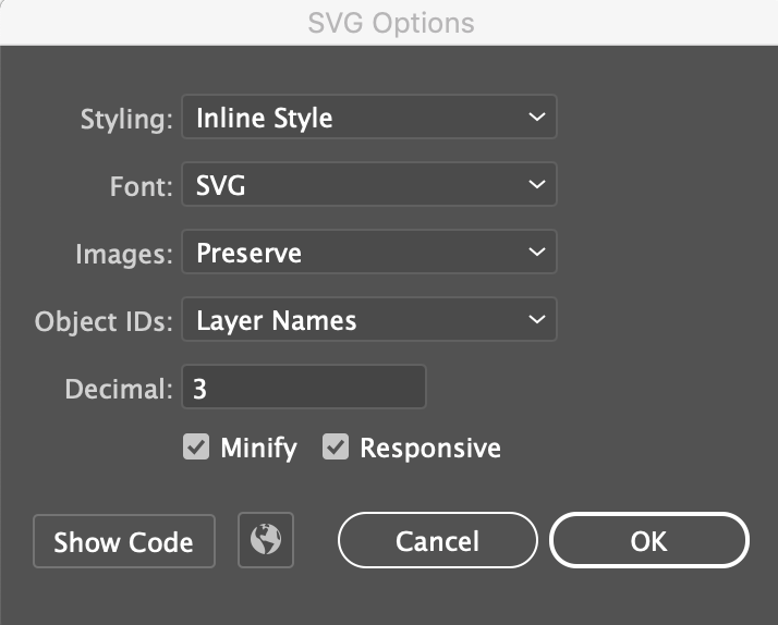
We highly recommend Adobe Illustrator’s SVG export tool (accessible via Export As… > SVG), which provides several options for optimizing your SVG code, as well as a code preview window. The following settings usually produce desirable results:

image-20240422-105735.png

JavaScript errors detected

Please note, these errors can depend on your browser setup.

If this problem persists, please contact our support.