By default, buttons inherit the Action color from your theme, but you can specify a custom color if you prefer.
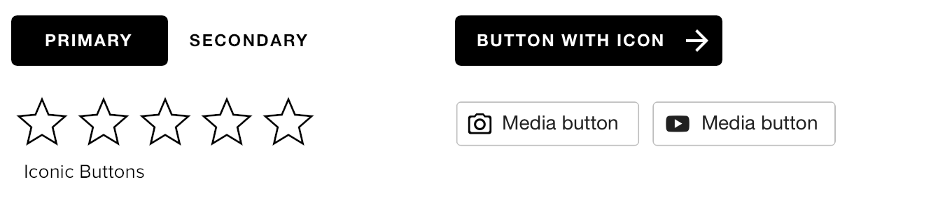
This color is used in all shaded areas of a button. In the following examples, your color would replace the black shown on background fills, text, borders, and icons.
Example Buttons
Best Practices
We suggest using the Action color for button elements, as shoppers will have an easier time learning to recognize this color as a cue of interactivity.
If you choose to use a unique color, try to make it familiar. For example, if text links are blue, and your large/graphical interactive elements are orange, consider matching your button colors to those orange items.