SpeedFlex comes with two pre-configured color palettes: “Minimal” and “Emplifi”.
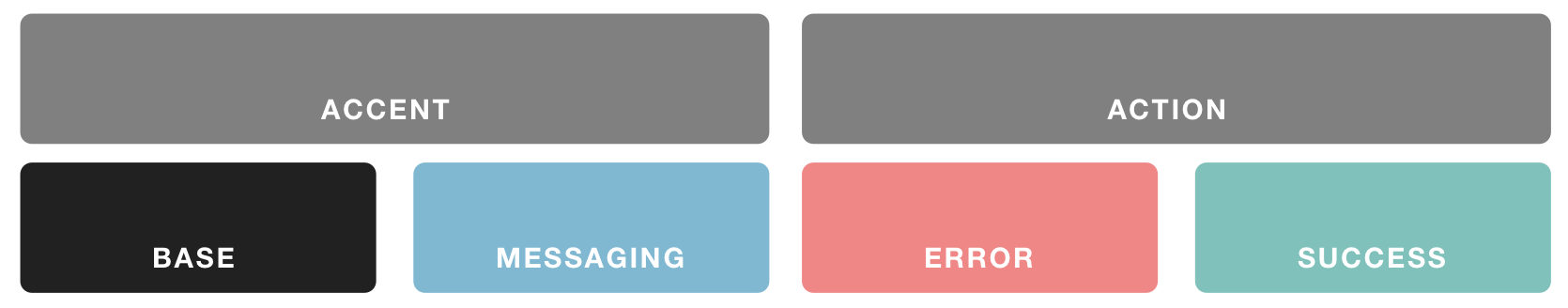
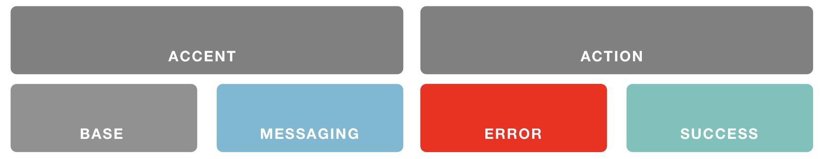
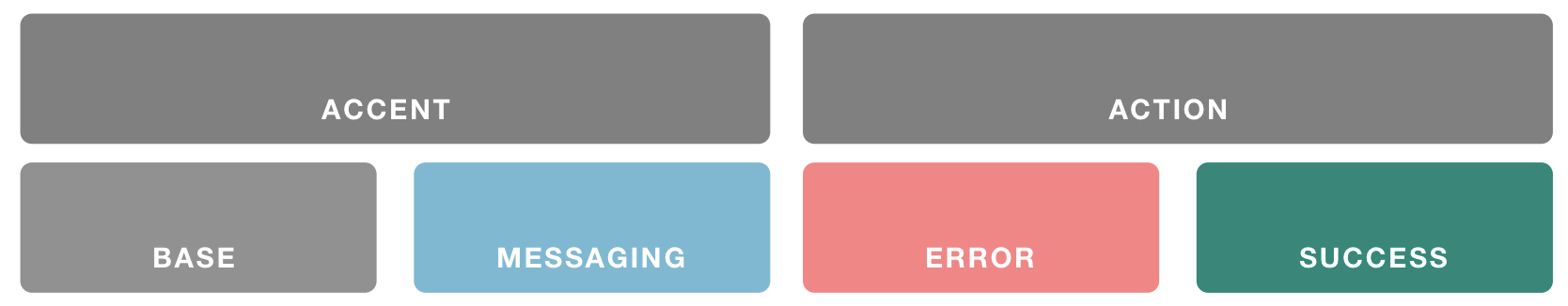
These palettes contain three major colors (Base, Accent, and Action), and three minor colors for specialty cases (Messaging, Error, and Success). Colors within these palettes are often treated with light variations to emphasize or de-emphasize an element. For example, if my Base color is black (#000000), containers with background shading appear in light gray.
Together, these colors drive every component’s default treatment in the design system.
Palettes
You can use one of our pre-configured palettes, or your own custom hex values for each of the color classes.
A color hex code is a way of specifying color using hexadecimal values. The code itself is a hex triplet, which represents three separate values that specify the levels of the component colors. The code starts with a pound sign (#) and is followed by six hex values or three hex value pairs (for example, #AFD645).
You can use tools like hexcolortool.com to mix custom colors and to copy and paste their values, or you can sample them right off your existing website using browser extensions like ColorZilla.
Color overrides for individual elements (or families of elements) are possible where noted, or by using custom CSS.
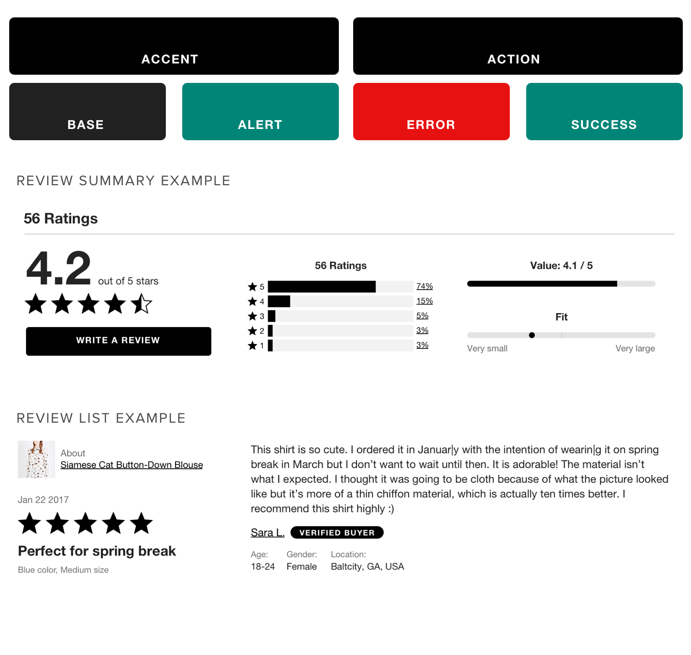
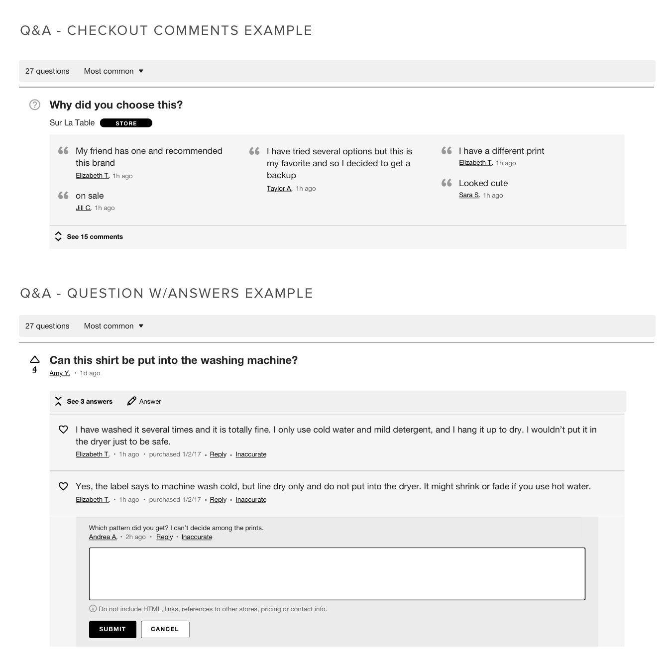
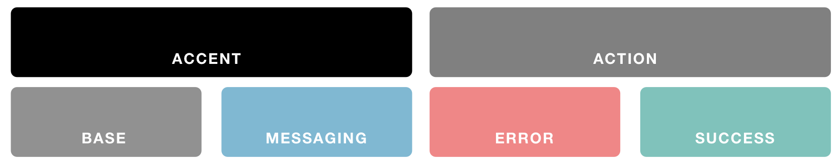
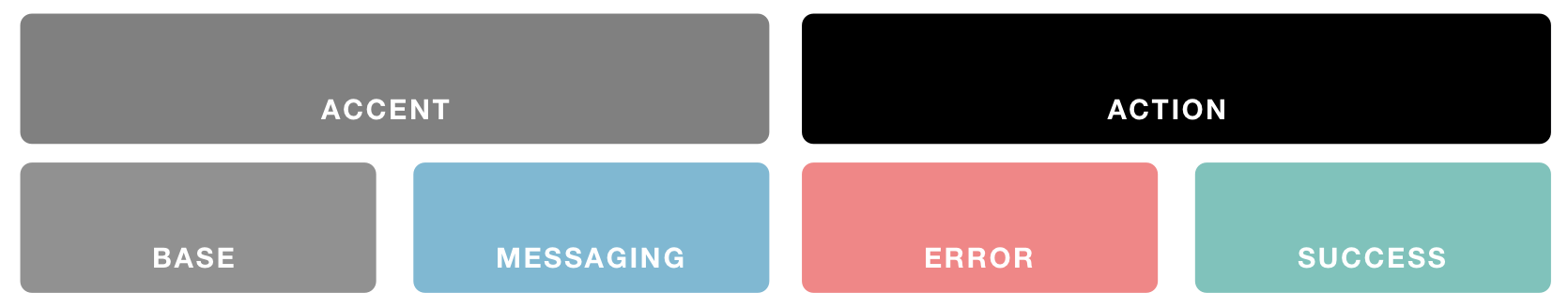
Minimal Palette
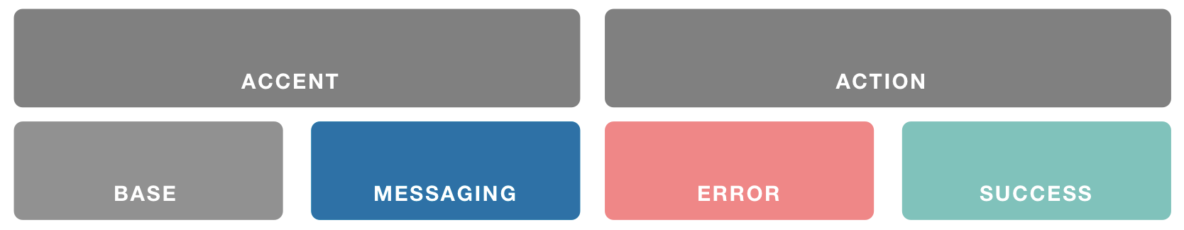
Emplifi Palette
Color Classes
Base
Best practice: Use a dark color that matches the body text on your store’s pages.
Where it’s used:
-
Non-interactive text
-
Non-interactive icons without special meaning (such as those in form field hint text)
-
Background shading (using various opacity variations)
-
Borders
Accent
Best practice: Use a color that stands out and shoppers associate with your brand.
Where it’s used:
-
Non-interactive icons of particular interest to shoppers (review rating stars)
-
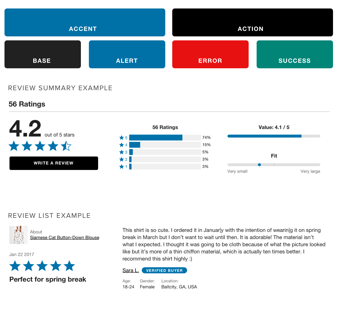
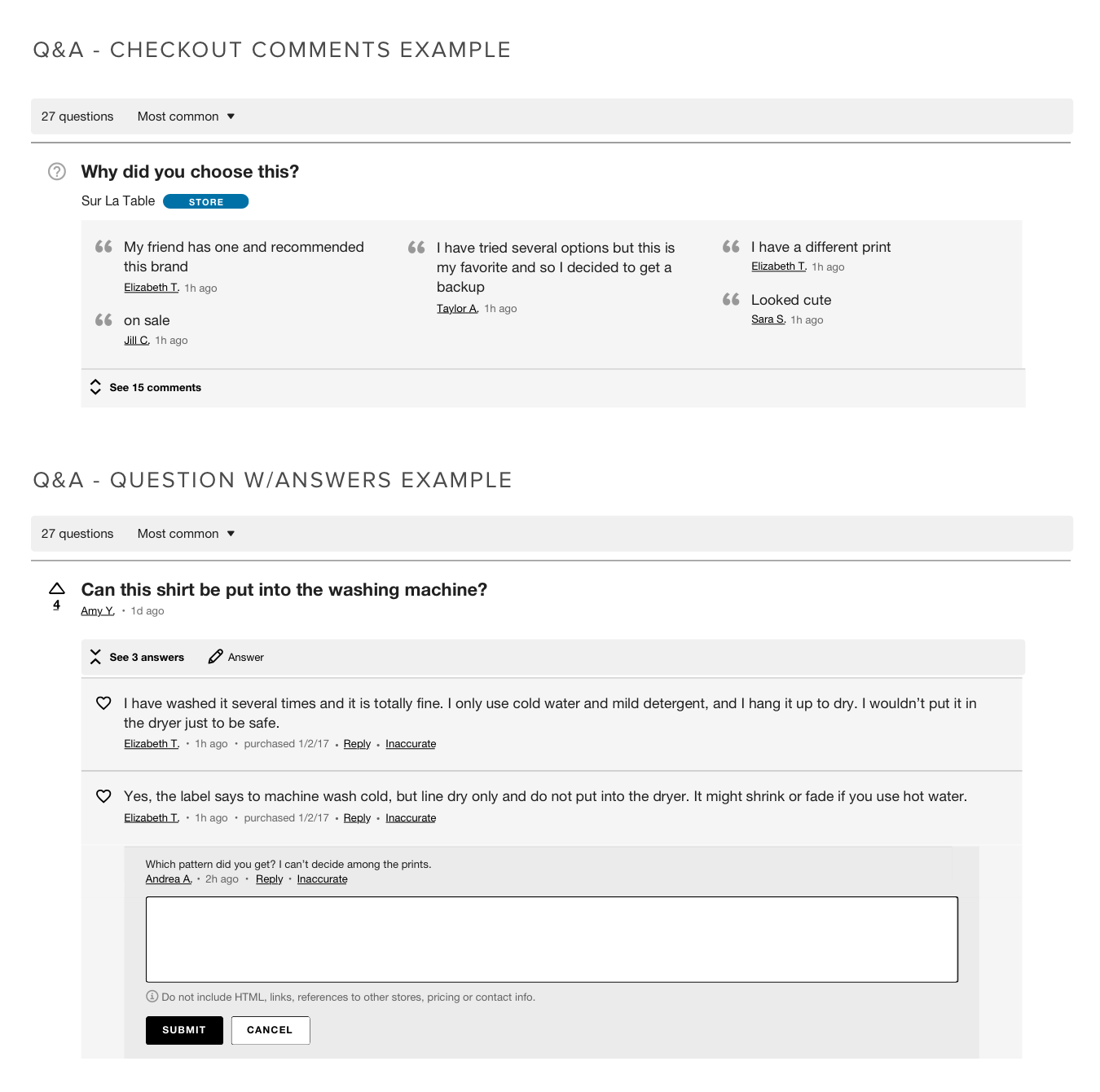
Elements that draw attention (Checkout Comments background)
-
Badges
-
Subdimensions
Action
Best practice: Use a color that matches other interactive elements (buttons, links) on your store’s pages.
Where it’s used:
-
Button backgrounds & borders
-
Text links
-
Interactive icons
-
Form element borders
Messaging
Best practice: Use a color with a neutral meaning. A secondary branding color can work well.
Where it’s used:
-
Message backgrounds (or text) with a neutral meaning. These messages provide helpful information to shoppers but do not communicate success or failure.
Example:

Error
Best practice: Use a color that communicates urgency, such as a shade of red.
Where it’s used:
-
Message backgrounds (or text) that communicate an error has occurred
-
Icons that communicate an error has occurred
Example:

Success
Best practice: Use a color that communicates success, such as a shade of green.
Where it’s used:
-
Message backgrounds (or text) that communicate successful completion of an action
-
Icons that communicate a success state
Example:
